Most businesses don’t have a traffic problem; they have a “bucket” problem. They spent thousands of dollars into Google and Meta ads, driving high-intent users to websites that are cluttered, slow, and confusing.
The result? The average landing page conversion rate across industries is a dismal 2.35%. This means for every 100 clicks you pay for, 97 potential customers leave without a trace.
However, top-tier performance marketers consistently achieve conversion rates of 20% to 30% using a specific layout I call “The Simple Stack.”
This case study breaks down that exact architecture. It’s not about flashy design; it’s a psychological machine engineered for one purpose: turning a visitor into a lead.
Phase 1: The Desktop Experience – The “Hero Split”
On a desktop screen, your greatest enemy is distraction. If a user has to hunt for the call-to-action, you’ve already lost them. The solution is the 50/50 Split Screen.
The Visual Setup
- The Left Side (50%): A high-quality image of your product or the desired result. This is for building desire.
- The Right Side (50%): A clean, white space dedicated entirely to the Lead Capture Form.
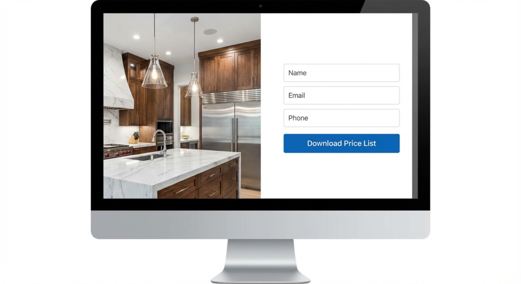
Notice the contrast. The dramatic, high-quality image on the left makes the white form on the right “pop.” The eye is naturally drawn to the brightest part of the screen, where the action takes place.
Why This Works
- Zero Navigation: Notice the absence of a “Home,” “About Us,” or “Blog” menu. This is the “Tunnel Vision” rule. The user has only one path forward: engaging with your offer.
- Above the Fold: The call-to-action button is immediately visible without scrolling. Everything the user needs is there the moment the page loads.
Phase 2: The Mobile Experience “Vertical Velocity”
In 2025, with over 70% of PPC traffic coming from mobile devices, you can’t just shrink your desktop site. You must revamp it for a mobile-first experience.
The “Thumb Zone” Rule
On mobile, the hierarchy must be optimized for speed:
- Headline: State the value proposition immediately.
- Visual Anchor: A smaller, high-impact version of the hero image.
- The Form: This must appear without delay.
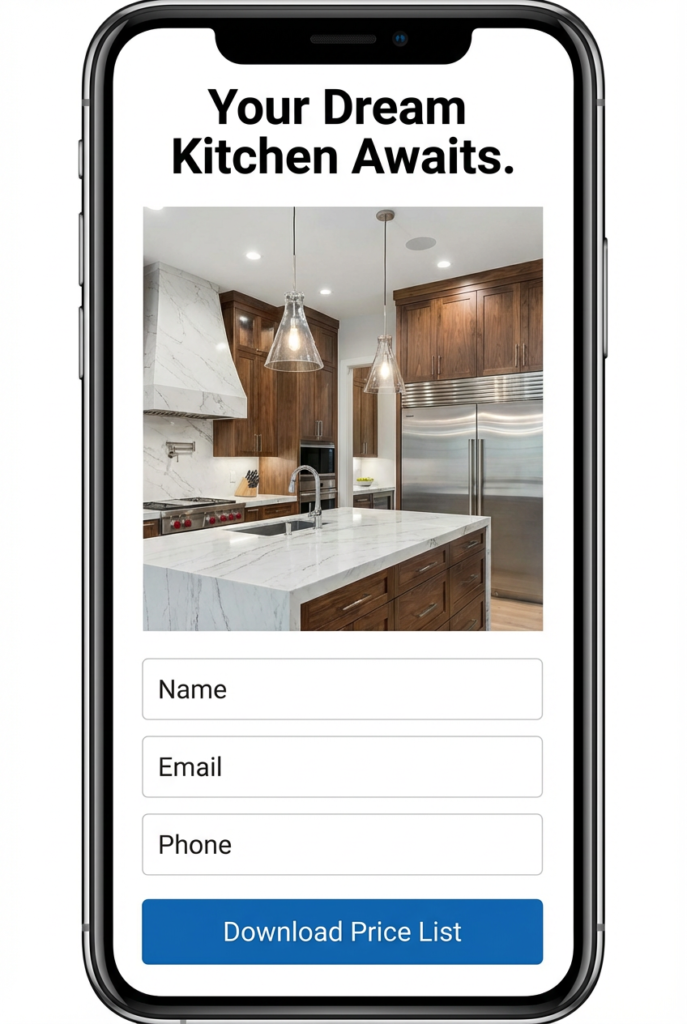
The form isn’t buried at the bottom of the page. It’s the star of the show, visible without scrolling. The input fields are large and easy to tap.
The “Fat Finger” Optimization
Notice the size of the “Submit” button. It should span the full width of the screen. This simple adjustment prevents user frustration. If a user tries to tap a button and misses, they often give up. Make your buttons impossible to miss.
Phase 3: The “Hybrid” Engine (Form + WhatsApp)
This is the secret sauce to push your conversion rate from 10% to 30% and beyond. You have two types of customers:
- The Researcher: They prefer to download a brochure or price list to review later. They will use the Form.
- The Hunter: They have an urgent problem and want answers now. They will opt for WhatsApp.
If you only offer a form, you lose the Hunter. If you only offer WhatsApp, you lose the Researcher. You need a Hybrid-Direct Strategy.
The Mobile “Sticky Footer”
To implement this on mobile without cluttering the screen, use a Sticky Footer. This is a bar that remains fixed at the bottom of the screen as the user scrolls.
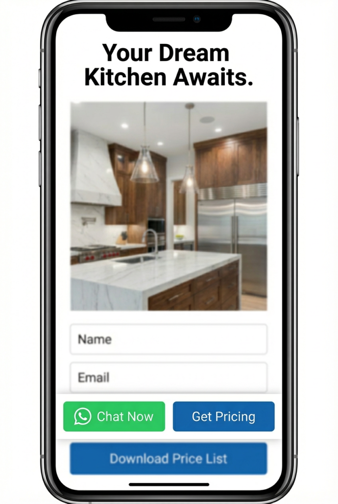
By giving users control over how they communicate, you remove the friction of forced communication methods. You’re saying, “Want to chat? We’re here. Want to read? Here’s the file.”
Phase 4: The “Soft Ask” & Building Trust
The “Soft Ask” vs. The “Hard Sell”
Never use high-friction words like “Contact Us” or “Submit” on your buttons. These terms imply work and pushy sales calls.
- Bad: “Request a Quote” (Sounds expensive and intimidating).
- Good: “Download Price List” or “Access Brochure” (Sounds valuable and free).
By offering a “Digital Asset” (like a brochure, checklist, or pricing guide) in exchange for their information, you’re creating a fair value exchange.
The “Skimmable” Trust Section
Below the fold, avoid dense paragraphs. Use Bullet Points with Green Checkmarks.
The human brain processes symbols 60,000 times faster than text. A green checkmark universally means “YES.” Use this to your advantage with generic, industry-agnostic benefits.
To replicate this “30% Blueprint” for your business, hand this checklist to your web developer:
- Remove the Header Menu: Eliminate all navigation links.
- Desktop Layout: Implement a 50% Image (Left) / 50% Form (Right) design.
- Mobile Layout: Ensure the layout is stacked vertically, with the form visible within one scroll.
- The Hybrid Footer (Mobile): Implement a sticky bar with “WhatsApp” (Left) and “Go to Form” (Right) buttons.
- The Desktop Chat: Add a floating WhatsApp widget in the bottom-right corner.
- The CTA: Change the button text from “Submit” to “Get Brochure/Pricing.”
Complexity may feel productive, but simplicity produces profit. This landing page framework works because it respects the user’s time, offers multiple ways to connect, and focuses entirely on the value exchange.